Skip to content

⭐ New from Rentsync: Renter SurveysSee What They're All About!

elora-hero
Pill Buttons_Portfolio Pages (6)
elora logo

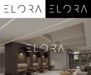
Tucked into one of Montréal’s most desirable neighbourhoods, Elora offers refined rental living at the intersection of Outremont, Ville Mont-Royal, and Glenmount.

Designed for residents who value sophistication and ease, Elora needed a brand and digital presence that could communicate luxury in a way that felt warm, approachable, and quietly confident. Rentsync was brought in to deliver a full suite of creative services, from name development and visual identity to web execution and print materials, that would help Elora stand out in a high-demand rental market.

Property Naming

The name Elora was developed to evoke elegance and calm, with soft phonetics and a timeless feel. It’s a name that speaks to elevated living without overstating it, easy to remember, easy to pronounce, and rich with lifestyle potential.

Subtle and self-assured, Elora fit the project’s vision from day one: a name that would carry through gracefully across signage, digital platforms, and printed materials — and that would resonate equally in both French and English.

elora branding

Branding

Elora’s brand identity was built to mirror its quiet luxury - a carefully curated balance of softness and structure. The logo and wordmark are minimal and clean, with slight typographic flair that suggests refinement without ornamentation. The brand palette leans into neutrals with depth: earthy tones that are taken directly from the building's stunning interior design and decor.

From digital headers to printed brochures, the brand system is consistent, legible, and elegant; the kind of identity that doesn’t try too hard, because it doesn’t have to.

Elora-branding-mockup-small-1b

Theme Website

Elora’s website was designed using Rentsync’s Sage theme, adapted to support the property’s calm, elevated brand voice. The site opens with a textured visual experience: large-format images, ambient transitions, and modern typography all working together to establish tone immediately.

Elora desktop mockup SMALL

Content is deliberately paced, with each section guiding the visitor through suite information, gallery visuals, and neighbourhood context in a way that feels smooth, not salesy. On mobile or desktop, the site performs cleanly, giving prospective renters exactly what they need while reinforcing the premium experience that defines Elora.

elora-interior

Floorplan Navigator

To support seamless suite discovery, we integrated our interactive Floorplan Navigator, customized to match Elora’s brand environment. The tool lets users explore layout options by bedroom type, price, and availability, all within a clean, branded modal that doesn’t disrupt the overall site experience.

It’s a functional layer built for renters who want control, transparency, and flexibility, and it adds meaningful value to the leasing journey by converting browsing into action.

elora fpn (1)

Print Marketing

To extend the brand experience offline, we created a suite of print materials that echoed Elora’s digital tone: understated, image-driven, and thoughtfully designed. These included floorplan handouts, leasing brochures, and signage assets, all aligned with the visual and verbal identity established on the website.

With rich photography, elegant layout systems, and clear, concise messaging, the print suite became a key part of Elora’s lead nurturing strategy — helping prospects carry the brand with them, even after they’d left the site or the leasing office.

Eloira-postcard-v2-no-bg-small-(1)