
.png)
Located at 316 Des Meurons in the heart of Winnipeg’s historic St. Boniface district, Le Market is a boutique rental community that blends bold design with art deco flair. With its distinctive arches, warm rust-toned façade, and curated amenity offerings, Le Market was developed for renters who want something that feels truly different: stylish, walkable, and full of personality.
Le Market doesn’t try to blend in. It sets the tone for elevated rental living in St. Boniface, confidently carving out a place as the trendsetter in the neighbourhood.
Property Naming
The name Le Market was chosen to reflect both cultural heritage and modern lifestyle. Inspired by the shops that were once located at this location, the name strikes a balance between nostalgic charm and modern rental appeal.
Bilingual, evocative, and easy to remember, Le Market gives the property a confident sense of place within St. Boniface’s vibrant, French-rooted community.

Branding
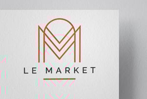
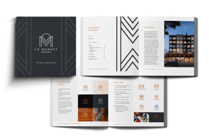
The brand identity for Le Market is a bold blend of historical character and modern design sensibility. Drawing from art deco influences and the building’s distinctive archways, the visual language is confident, elegant, and memorable.
The logo pairs ornate geometry with clean, modern typography - a statement mark that anchors the brand across signage, digital, and print.
The colour palette is centered around a rich rust orange, supported by warm greys, black, and tan which creates a backdrop that feels simultaneously vintage and current.
The typeface, Raleway, is crisp and versatile, chosen for its legibility and its ability to balance ornamentation with simplicity.
Photography and graphic elements are intentionally rich and high contrast, with bold lifestyle imagery and design-forward accents that reinforce Le Market’s identity as a unique and expressive place to live.

Theme Website
To bring Le Market’s bold personality online, Rentsync delivered a website using our Studio16 theme, customized to showcase the property’s distinct identity. With its strong art deco influence and rich colour palette, the brand called for a layout that felt both structured and expressive and Studio16 delivered the perfect foundation.
The site balances confident visuals with smooth usability. We emphasized architectural elements like Le Market’s signature arches through bold photography and stylized blocks, while keeping the navigation clean and intuitive. Every detail, from button styling to header treatments, was aligned to the brand’s tone: hip, historical, and a little unexpected.

Mobile optimization was key, ensuring the site remained striking and functional across devices. Designed to perform as well as it looks, the Le Market website not only captured attention - it moved prospects toward action.

Print Marketing
To complement the digital experience and reinforce Le Market’s distinctive brand throughout the leasing journey, Rentsync developed a suite of print materials designed with the same visual boldness and confidence found on the website.
From custom floorplan sheets to take-home brochures, every piece carried through the property's unique rust-and-charcoal palette, clean type treatments, and stylized layout structure. We leaned into the building’s art deco cues, incorporating subtle geometric accents and high-contrast photography that made each touchpoint feel considered and cohesive.
These materials weren’t just informational, they were extensions of the brand. Whether prospects encountered them at a showing, in a local shop, or tucked into a leasing folder, they left with something memorable, polished, and unmistakably Le Market.

