
.png)

Located in the heart of Winnipeg’s cultural district, Muse Flats is a 119-suite rental community offering a blend of premium, market, and affordable units.
Just steps from the University of Winnipeg and surrounded by art galleries, transit options, and local eateries, Muse Flats is built for residents who value creative energy, inclusive living, and functional, urban design.
The building was launched during a particularly challenging period (mid-pandemic) and required a brand and lease-up strategy that could inspire confidence and interest digitally, from day one.
Property Naming
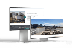
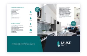
The name Muse Flats was developed to reflect the building’s creative energy and its location within Winnipeg’s cultural core, just steps from the Winnipeg Art Gallery, Plug-In Institute of Contemporary Art, and the University of Winnipeg.
The word Muse speaks to inspiration - a nod to the artists, students, and urban professionals the building was designed to serve. Paired with Flats, a term that suggests approachable, design-focused urban living, the name feels both aspirational and grounded.
It’s a name that welcomes everyone, from affordable housing seekers to market-rate renters, into a space that feels considered, modern, and inclusive.

Branding
The visual identity for Muse Flats draws directly from the building’s architecture. The logo mirrors the asymmetrical window patterns and modular structure of the property, symbolizing the way diverse units - and by extension, people - come together to form one cohesive community.
The colour palette was developed with versatility in mind. The dark onyx colour sets a high-contrast backdrop for the blue-green hues that comprise the rest of the palette.
Muse’s brand elements: from typography to iconography, strike a balance between clean design and quiet personality, just like the property itself.

Theme Website
To support the lease-up of Muse Flats during a challenging launch window, Rentsync delivered a high-performing website using our Aspen theme: a flexible, gallery-forward template built to showcase properties with visual depth and diverse unit types.
The site was designed to reflect Muse’s community-driven, design-conscious identity, with soft colours, clean navigation, and easy access to critical details like unit options, amenities, and neighbourhood insights.

Despite launching at the height of a global pandemic, the site consistently attracted high volumes of qualified traffic.
Muse Flats averaged over 3,000 website visits per month, acting as the digital hub for the broader lease-up campaign.
By pairing an adaptable website theme with intentional design and branding alignment, the Muse site made a strong first impression, and helped move prospects confidently from consideration to conversion.

Digital Marketing
With the launch of Muse Flats coinciding with the height of the COVID-19 pandemic, Rentsync’s digital marketing efforts needed to work harder and smarter to generate awareness, build trust, and convert leads without relying on in-person tours or events.
We developed a multi-channel marketing strategy tailored to Muse’s mixed-unit offering and community-forward brand voice. Campaign efforts focused on affordability, design appeal, and location benefits, aiming to attract a wide demographic- from students and healthcare workers to creative professionals and small families.
The campaign mix included:
- Targeted Google Ads optimized for affordability, transit access, and suite availability
- Paid social media campaigns designed to highlight community features like the rooftop terrace, art & music space, and inclusive unit mix
- Rental listing optimization to drive qualified traffic from syndicated platforms
- Landing page coordination to support focused lead capture for different unit types


Through consistent creative, high-performance ad strategies, and agile audience targeting, Muse Flats’ digital campaign became a key driver of its early success, even in an unpredictable leasing environment.
Campaign Highlights:
- Over 3,000 monthly website visits during peak lease-up
- 100% of affordable units leased within the first three months
- Strong ad clickthrough rates driven by creative aligned with Muse’s branding and tone
Print Marketing
To complement digital efforts and reinforce brand presence in the community, Rentsync developed a suite of print marketing materials that extended Muse Flats’ visual identity beyond the screen and into the neighbourhood.
All materials were designed with Muse’s architectural cues in mind: incorporating asymmetry, soft colour accents, and modular layouts that reflected the building’s character. Typography, iconography, and copy tone were kept consistent with the digital brand to ensure a seamless renter journey from street to site.
Whether a prospect saw a flyer at a nearby café or picked up a floorplan sheet at a leasing office visit, the message was clear: Muse Flats offers inspired urban living — for everyone.
Key deliverables included:
- Custom flyers and posters highlighting key amenities, suite options, and location benefits
- Branded print-ready floorplan sheets to support leasing staff and onsite viewings
- Informational materials distributed near campus, art galleries, and healthcare centres to reach Muse’s diverse target audience

