Skip to content

⭐ New from Rentsync: Renter SurveysSee What They're All About!

stack-hero
Pill Buttons_Portfolio Pages (2)
stack logo

Located in Toronto’s established Bayview and Eglinton neighbourhood, The Stack is a luxury rental community that blends contemporary
design with the comfort of familiar surroundings. With premium suite finishes, modern amenities, and walkable access to local retail
and the future Eglinton Crosstown LRT, The Stack appeals to young professionals, design-minded renters, and families seeking upscale city living,
without the pressure of ownership.

Property Naming

The name The Stack emerged from the development’s architectural design: a modern, angular building composed of distinct layers and clean lines.
It’s a name that captures both the physical structure and the broader lifestyle philosophy: a stacked approach to urban living,
where luxury, location, and flexibility come together.


Crisp and modern, the name is memorable and brandable, and instantly evokes a vertical urban lifestyle, while being casual enough to feel approachable.

naming 1

Branding

The Stack’s visual identity is built around a minimalist geometric logo that mirrors the building’s silhouette. Clean, stacked shapes form
the foundation of the mark, establishing visual cohesion while allowing space for playfulness through colour.


The branding balances strong typography with a pastel palette — a striking combination that sets the building apart in a mature neighbourhood.
These muted pastel tones inject youthful energy into the brand, while still maintaining a sense of sophistication.


Together, the logo and colour system represent the harmony of “nostalgia and new”: a modern rental lifestyle rooted in a familiar, walkable community.
Every touchpoint, from the site to signage, reinforces this personality.

the stack style guide

Custom Website

To reflect The Stack’s modern, design-forward identity, Rentsync developed a sleek website experience that balances
editorial visuals with high-conversion functionality.

The site was built to appeal to design-conscious renters, especially young professionals and growing families, by blending minimalist layouts, bold type choices, and soft pastel accents pulled directly from the brand palette.


Every page reinforces the property's unique tone: stylish, welcoming, and elevated without being overdesigned.

the-stack-website-mockup-PSD-4

The Stack’s youthful, contemporary personality carries through in every UX element, from micro-animations to colour accents, making the
leasing journey feel as polished as the brand itself.

site2

Floorplan Navigator

The website also features a custom interactive Floorplan Navigator, giving renters control over their experience from the moment they land on the page.

Prospects can easily browse bachelor, 1-bedroom, 2-bedroom, and 3-bedroom layouts, view availability by floor, and access real-time pricing. By surfacing this level of detail up front, without the need for downloads or separate tab, the tool simplifies suite discovery and accelerates lead conversion.

This was especially valuable in a competitive midtown Toronto market, where informed renters expect both convenience and transparency from the outset.

fpn

Digital Marketing

To launch The Stack and build momentum ahead of occupancy, Rentsync executed a multi-channel digital marketing campaign tailored to the building’s vibrant, design-forward brand and upscale midtown location.

With the goal of driving qualified traffic to the new website, we developed a campaign strategy that highlighted The Stack’s premium features, modern suites, and unique identity within the Bayview & Eglinton neighbourhood. Each ad set was crafted to feel fresh, stylish, and aspirational, mirroring the personality of the building itself.

The campaign mix included:

  • Google Ads targeting location- and amenity-based keywords
  • Paid social media campaigns showcasing suite interiors and branding elements
  • A pre-launch teaser email campaign introducing The Stack’s concept and linking to the live site
  • Conversion-focused landing experiences that tied directly into the lead capture flow


Socials the stack

This strategic blend of visual storytelling and performance marketing helped establish The Stack as a must-see property from day one — not just another listing, but a destination.

Campaign Highlights:

  • Immediate traffic surge to the newly launched site
  • Strong alignment between digital ads and on-page experience
  • Email campaign reinforced brand awareness and clickthrough among engaged audiences

Print Marketing

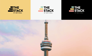
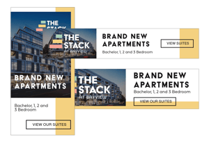
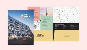
To support in-person leasing efforts and extend brand visibility in the surrounding area, Rentsync created a suite of custom print marketing materials that matched The Stack’s modern, playful identity.

Every piece was designed to leave a lasting impression, whether handed out at a tour, posted in a local café, or picked up during a site visit. With bold typography, confident spacing, and colour cues drawn directly from the brand, these materials turned standard handouts into brand-aligned extensions of the leasing journey.

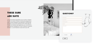
By giving prospects something tactile, beautiful, and on-brand to walk away with, The Stack stayed top-of-mind long after the first visit and helped convert initial interest into signed leases.

Key deliverables included:

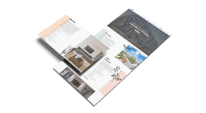
  • Take-home flyers showcasing suite types, building features, and neighbourhood highlights
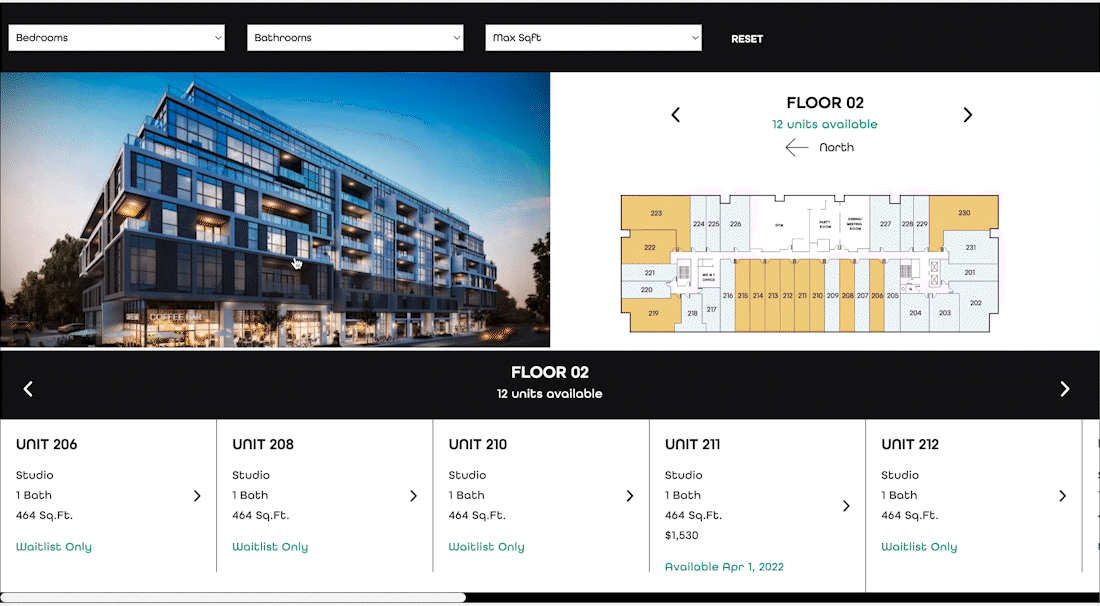
  • Printed floorplan sheets for leasing staff to use in tours and showings
  • Branded handouts and signage that echoed the soft pastel palette and stacked logo system
print1-1