Skip to content

⭐ New from Rentsync: Renter SurveysSee What They're All About!

shiplake-hero
Pill Buttons_Portfolio Pages (9)
Shiplake_Logo_Transparent Background

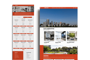
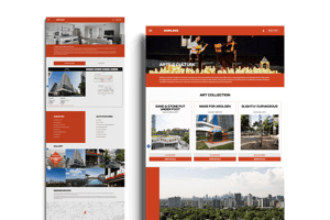
Shiplake is a third-generation, Toronto-based ownership and management group specializing in purpose-built rental communities. Their mission centers on creating elevated living experiences that blend premium design, hospitality-level service, and vibrant resident culture.

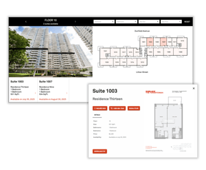
Their corporate site serves as the digital face for multiple properties, including Balliol Park, Lillian Park, The Torontonian, and Tippett Par, typing them together under a unified brand.

Custom Website

Rentsync designed and developed a fully custom website for Shiplake that reflects the sophistication and professionalism of their brand. The project required more than just a property listing tool, this was about creating a centralized digital experience that could support multiple audiences, including prospective renters, partners, and stakeholders, while maintaining a polished, upscale tone.

shiplake-desktop-mockup-small

We focused on clean architecture, strong visual hierarchy, and brand-aligned styling that carried through every page. Each section was thoughtfully structured to let the content breathe, allowing Shiplake’s voice and portfolio to shine without distraction.

Property pages were designed for clarity and ease of navigation, but with enough flexibility to feel distinct from one another while still connected to the overarching brand.

Shiplake website interior v2-small
Shiplake-website-interior-2-small_2

Floorplan Navigator

As part of the custom web experience, Rentsync implemented a tailored version of our Floorplan Navigator, allowing users to compare suite availability across two Shiplake properties at a time. This intentional approach makes it easier for prospective renters to explore layouts, pricing, and floor-by-floor availability.

The tool is fully integrated into the site’s aesthetic, maintaining the same level of polish and brand consistency as the rest of the experience. By narrowing focus to two properties at a time, the Navigator supports a more deliberate and informed browsing journey, encouraging deeper engagement.

This implementation demonstrates how Rentsync adapts powerful tools to fit not just the function, but the tone and purpose of a premium corporate site.

shiplake fpn

The final result is a high-impact corporate site that reinforces trust, communicates maturity, and positions Shiplake as a leading name in Canadian rental real estate, all while demonstrating what Rentsync does best: building digital platforms that are as beautiful as they are functional.

Print Marketing

To complement Shiplake’s refined digital presence, Rentsync created a suite of individual unit floorplan printouts designed for in-person leasing conversations. Each printout was developed to align seamlessly with the Shiplake brand: clean layouts, clear suite details, and a visual structure that balanced clarity with polish.

These materials weren’t just practical, they were part of a cohesive, cross-channel brand experience. Whether handed out during a tour or included in a leasing package, the floorplan sheets provided prospects with a tactile, branded reference point that reinforced the professionalism and consistency of the overall leasing journey.

By carrying the website’s design system into physical collateral, we helped ensure that every renter touchpoint, from screen to print, felt intentional and well-executed.

marketing floorplan shiplake v2 small